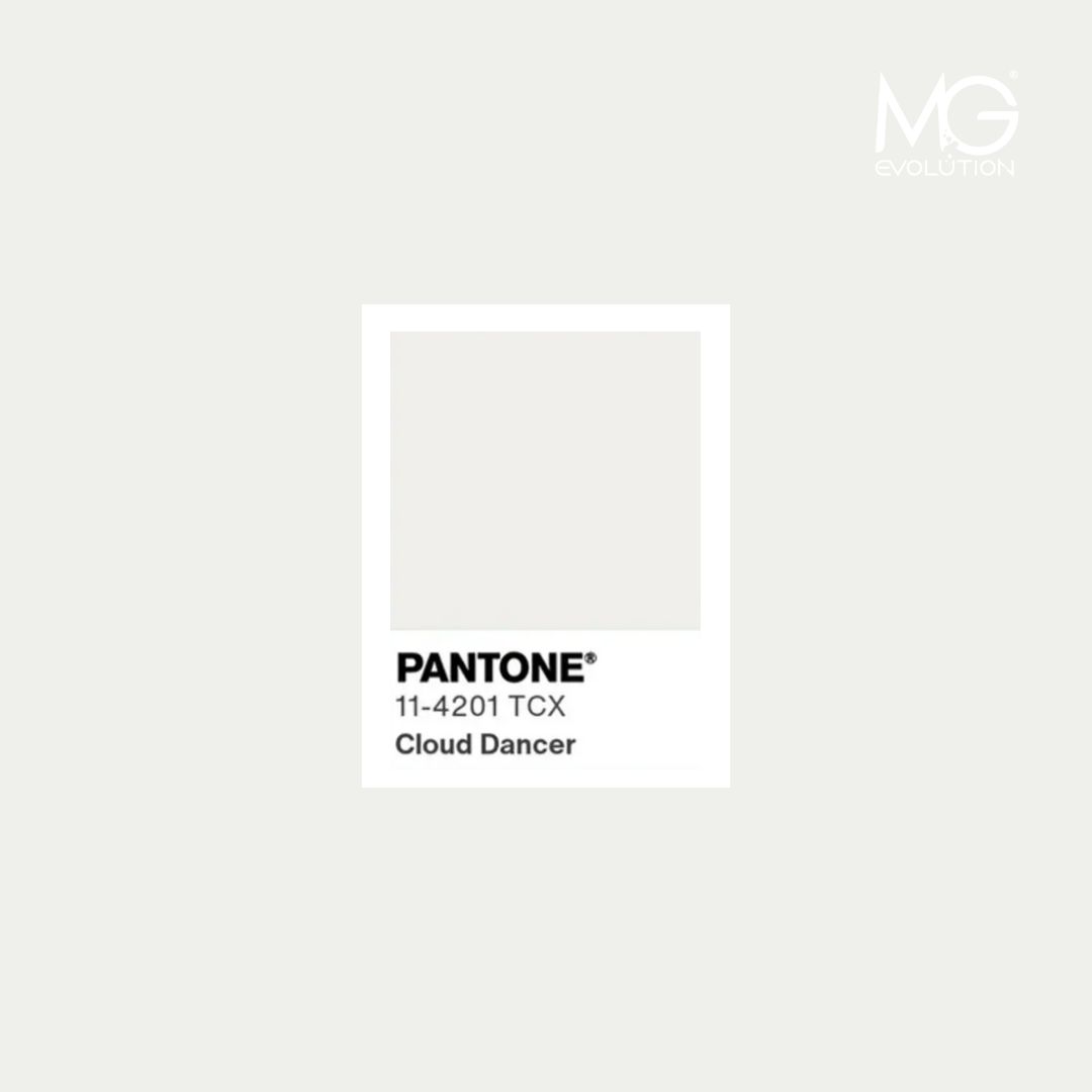
Pantone has announced Cloud Dancer (11-4201) as the Color of the Year 2026 — a subtle, natural white symbolizing freshness, clarity, and a sense of mental reset. What does this mean for beauty brands and manufacturers developing new product lines for upcoming seasons? Does the beauty industry truly follow global color trends? And most importantly: how can Cloud Dancer be leveraged to build a modern, competitive product portfolio?
Does the Color of the Year really influence the cosmetics market?
Although Pantone’s selection may seem distant from everyday production realities, in practice it becomes an important reference point for branding, packaging design, and visual communication. Color trends directly impact:
- the creation of new product lines,
- label and decorative material design,
- photo shoots and advertising concepts,
- the evolving aesthetics of premium and dermocosmetic brands.
Cloud Dancer, as a shade of purity and reset, perfectly aligns with the rise of clean beauty, skin minimalism, and transparent formulations.
Does this mean brands will shift toward an even more sterile minimalism?
It’s very likely — although the direction can take multiple forms.
Cloud Dancer in cosmetic packaging design
White has long symbolized quality and trust, but in its Pantone 2026 interpretation it becomes more organic, airy, and naturally soft. As a result, in cosmetic design it can highlight:
- ingredient purity,
- formula transparency,
- technological precision,
- a conscious approach to skincare.
Yet one key question emerges:
will brands limit themselves to white, or will they use Cloud Dancer as a neutral canvas for creative contrast?
This shade offers significant flexibility. It provides an ideal base for delicate pastels as well as bolder color accents that shape a product’s unique character.
How will Cloud Dancer influence beauty brand communication?
In visual storytelling, Cloud Dancer allows the audience to focus on what truly matters: textures, ingredients, natural raw materials, and the craftsmanship behind the formula.
It can become the foundation of:
- “quiet luxury”–inspired photography,
- minimalist premium campaigns,
- narratives of transparency and innovation,
- storytelling rooted in balance and calm.
This leads to another important question:
how can a brand use Cloud Dancer to stand out rather than blend in?
Where to look for visual inspiration for new projects?
Beauty brands and cosmetic manufacturers can draw insights from:
Pantone and Color Institute trend reports,
- fashion and interior design directions,
- luxury brand communication trends,
- shifts in consumer behavior (e.g., demand for minimalist and premium products),
- analysis of Asian markets, which often define beauty aesthetics years ahead.
The Color of the Year is more than a trend — it signals where global visual sensitivity is heading.
Pantone’s 2026 “Cloud Dancer” opens new possibilities for the beauty industry: redefining aesthetics, shaping modern product lines, and strengthening communication built on calmness, quality, and transparency.
The key question remains: will brands embrace this neutrality as a safe standard — or transform it into a creative space for bold contrasts?